
|
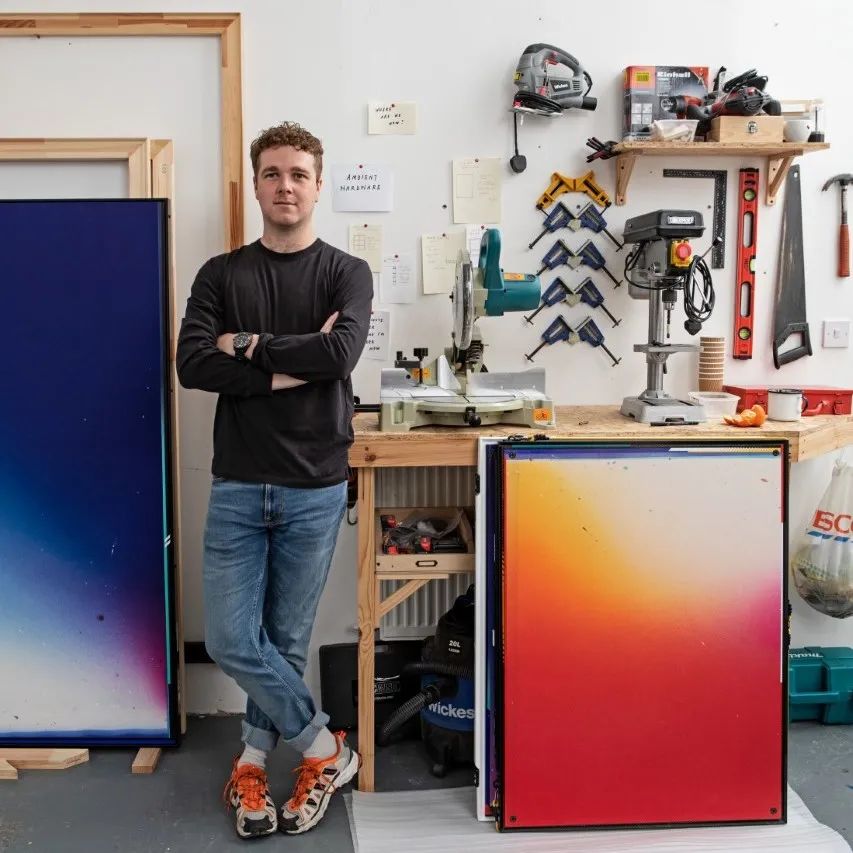
Ben Edmunds 艺术家工作室 伦敦 2022 |
 |
" 我想从我的BE签名中创建一个标志,让人们思考一个艺术家的作品和他们的'品牌'之间的关系。 "
 |
在你的作品中有着大量的运动器材,是何种动机激发你将它与绘画结合起来的? | ||||
|
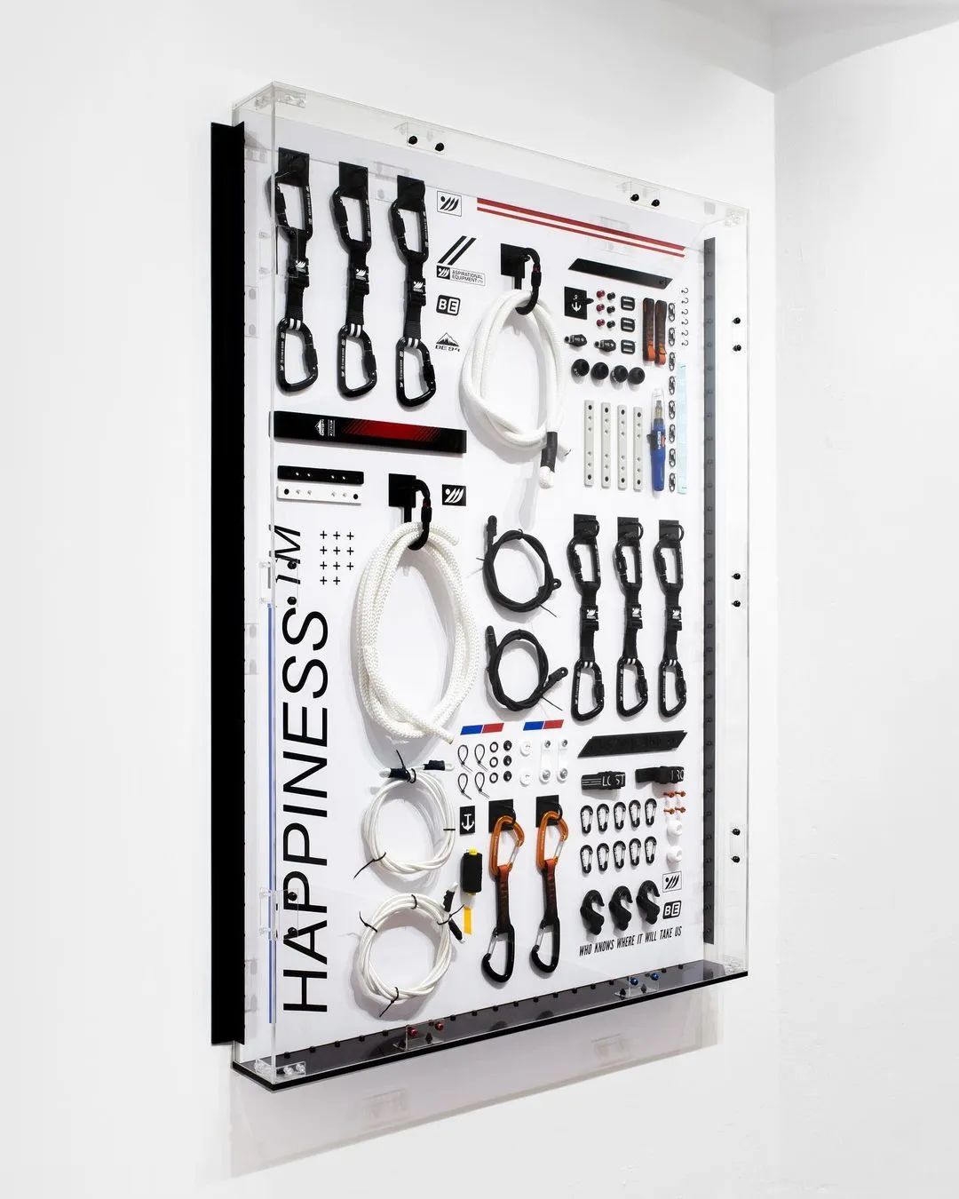
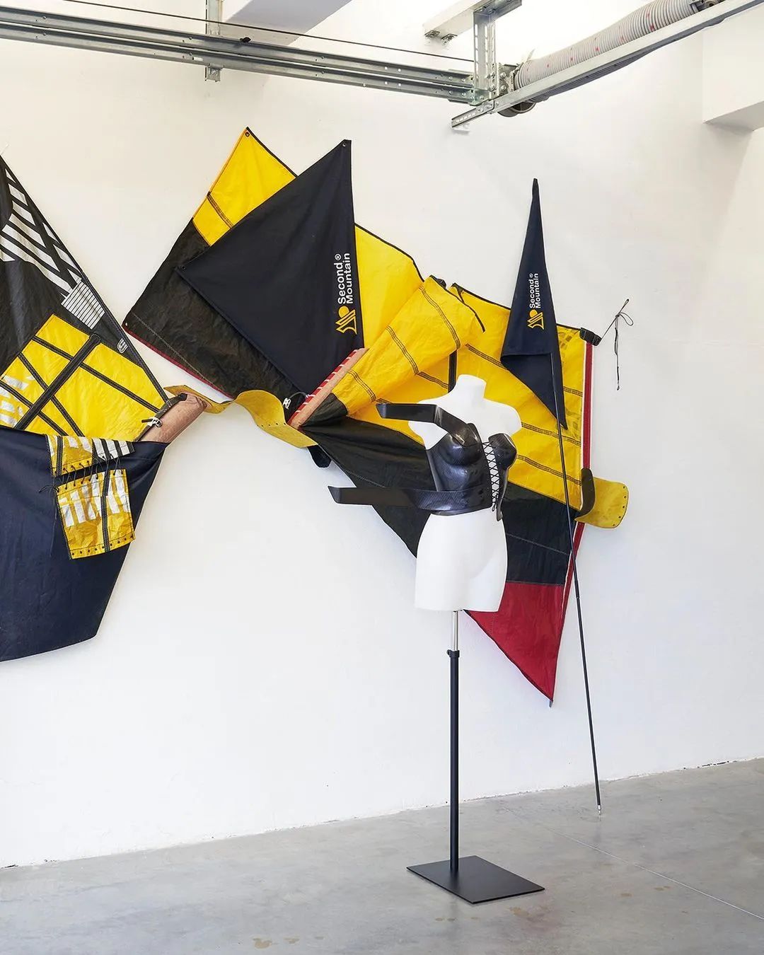
这个项目开始于我在RCA的最后一年,我之前一直在做基于户外度假海报的具象绘画。我早就对空想和探索的想法感兴趣,以及它们是如何与画家连接并产生关系,但我开始意识到,绘画是作为一种体验的工具,而不具有体验本身的功能。就像Goretex靴子可以帮助你爬山一样,一幅画可以帮助你实现什么?很快,我的画开始越来越像冒险装备,并从我的帆船和帆板的背景中获得灵感。 |
 |
||||
The way, far away (another view of the summit), 140×100cm, tools and equipment in Perspex vitrine, ©Ben Edmunds
|
你会如何描述你的创作过程? | ||||
|
我会分开描述它。我有两个工作室:一个在乡下用于绘画,一个在城市用于组装和雕塑。绘画工作室是混乱的,过程是感性的。伦敦的空间是更多冷静且有条理的。这描述了我的实践的两个方面,可能在很大程度上就是我的个性。 |
|
||||
|
您的作品中画框和画布之间的关系是什么? | ||||
|
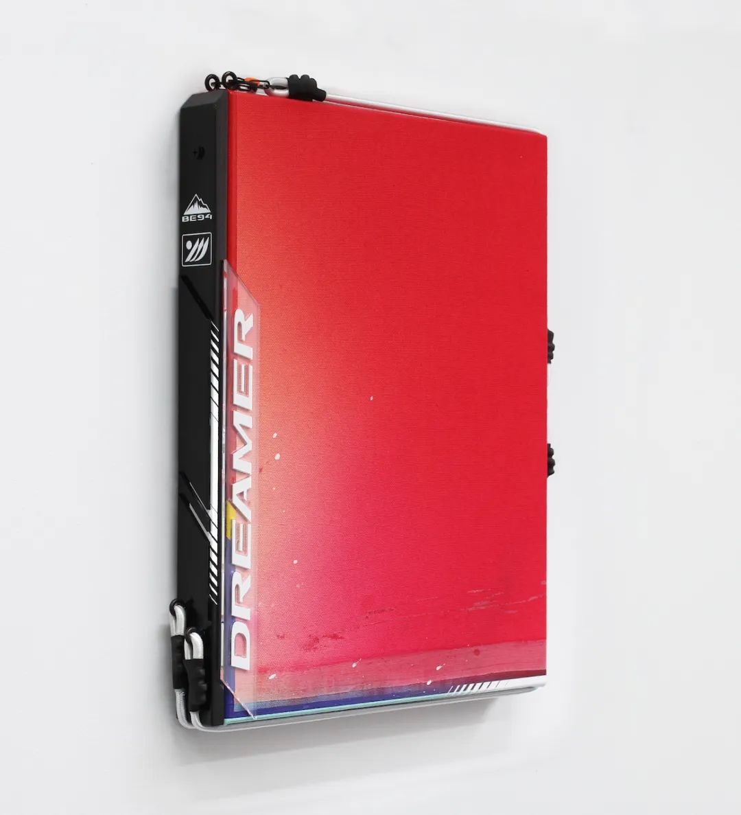
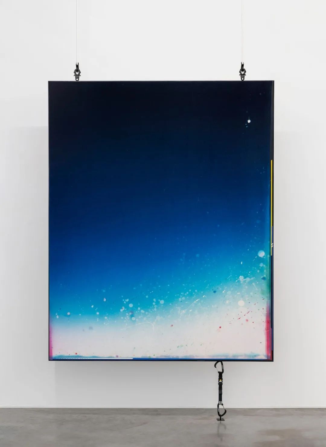
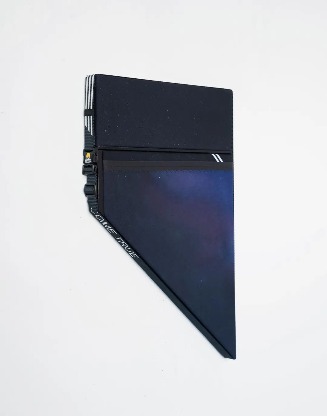
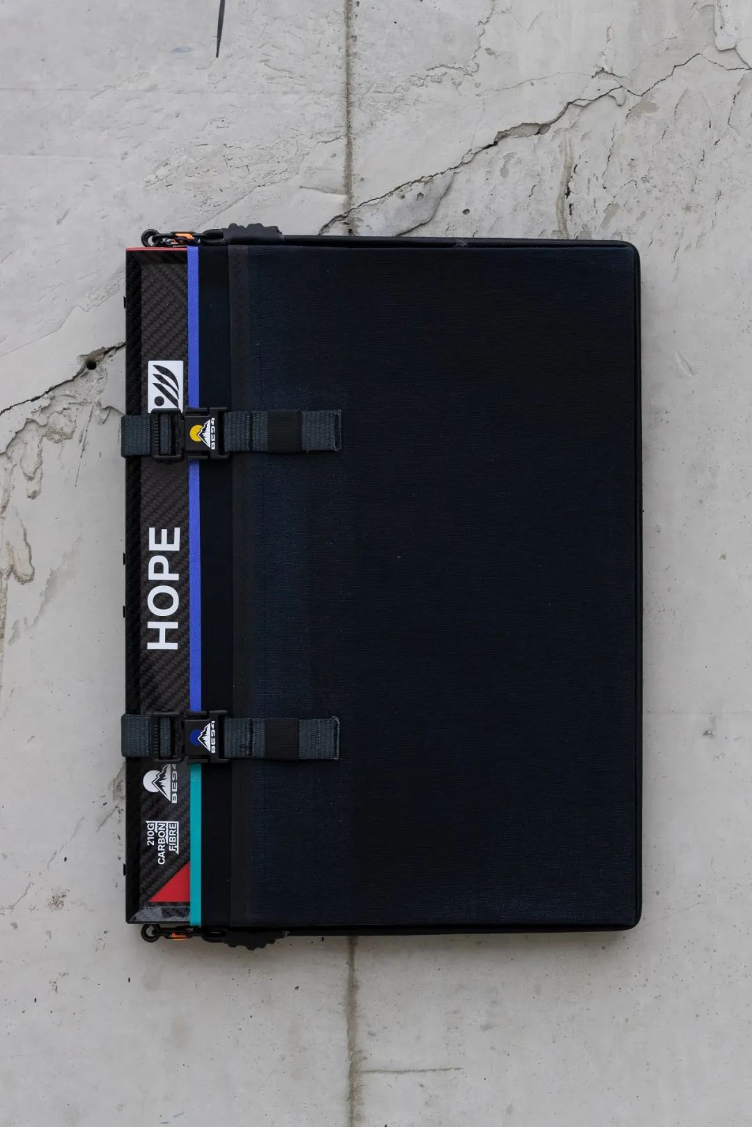
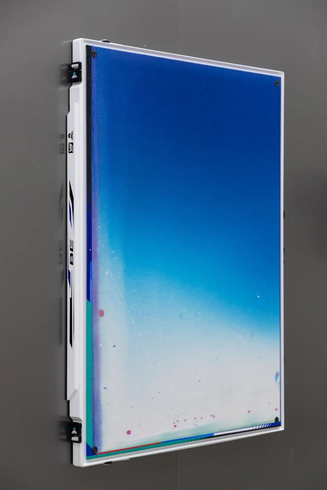
这种关系可以被看作是我刚才所描述的两个世界之间的调和。我喜欢找到创新的方法,把画布固定在画框上,使它看起来很光滑且坚固,看起来像现成品,但又有一种不可避免的手工质感。我喜欢把画布想象成船帆,把画框想象成船桨。我一直在寻找独特的方式,以使在更广泛的世界中,织物可以固定在框架上–无论是在冒险运动、广告牌还是在HGV墙面上,并尝试将这些方式应用到我的作品中,质疑传统绘画的惯常方式。 |
|
||||
Here at last then is gone, 40×30cm, fabric dye and acrylic on cancas with artist's frame, perspex, shock cords and carabiners, unique, 2020, private collection (BE), ©Ben Edmunds
|
你会称自己是一位色域绘画的艺术家吗?你认为你的作品中的绘画语言与其他同类艺术家最不同的是什么? | ||||
|
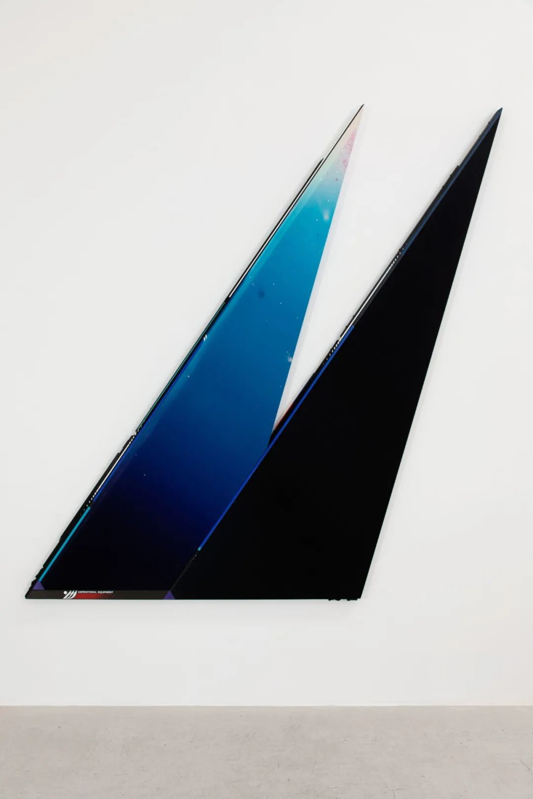
我会把自己的绘画实践描述为非常传统意义上的色域绘画。我非常欣赏朱尔斯·奥利茨基、埃斯沃兹·凯利等人的绘画。但这些艺术家已然是几十年前的先驱。色域现在是一个不那么时髦的流派,也许与它背后的父权制历史有关,但在本质上它是一个非常有意义的的方式。它与我们真正渴求的对开放空间和精神超越的愿景相联系,也与我们每天在屏幕上看到的数字梯度有关。不过,使我的作品与众不同的是,它被重新规划为一项冒险 "运动"。认识到制作–或观看–色域画的行为也是在广阔的空间中寻找体验,并将其带回我个人的户外运动经历。 |
|
||||
Epic moments pass, 200×160cm, fabric dye and acrylic on canvas with carbon fibre bar, wooden brackets and custom straps, unique, 2020, private collection (BE), photography- Artuur Vandekerckhove, ©Ben Edmunds
|
你是如何构思 "Something to hold onto"这个项目的?为什么它是以摄影而不是绘画的形式呈现 | ||||
|
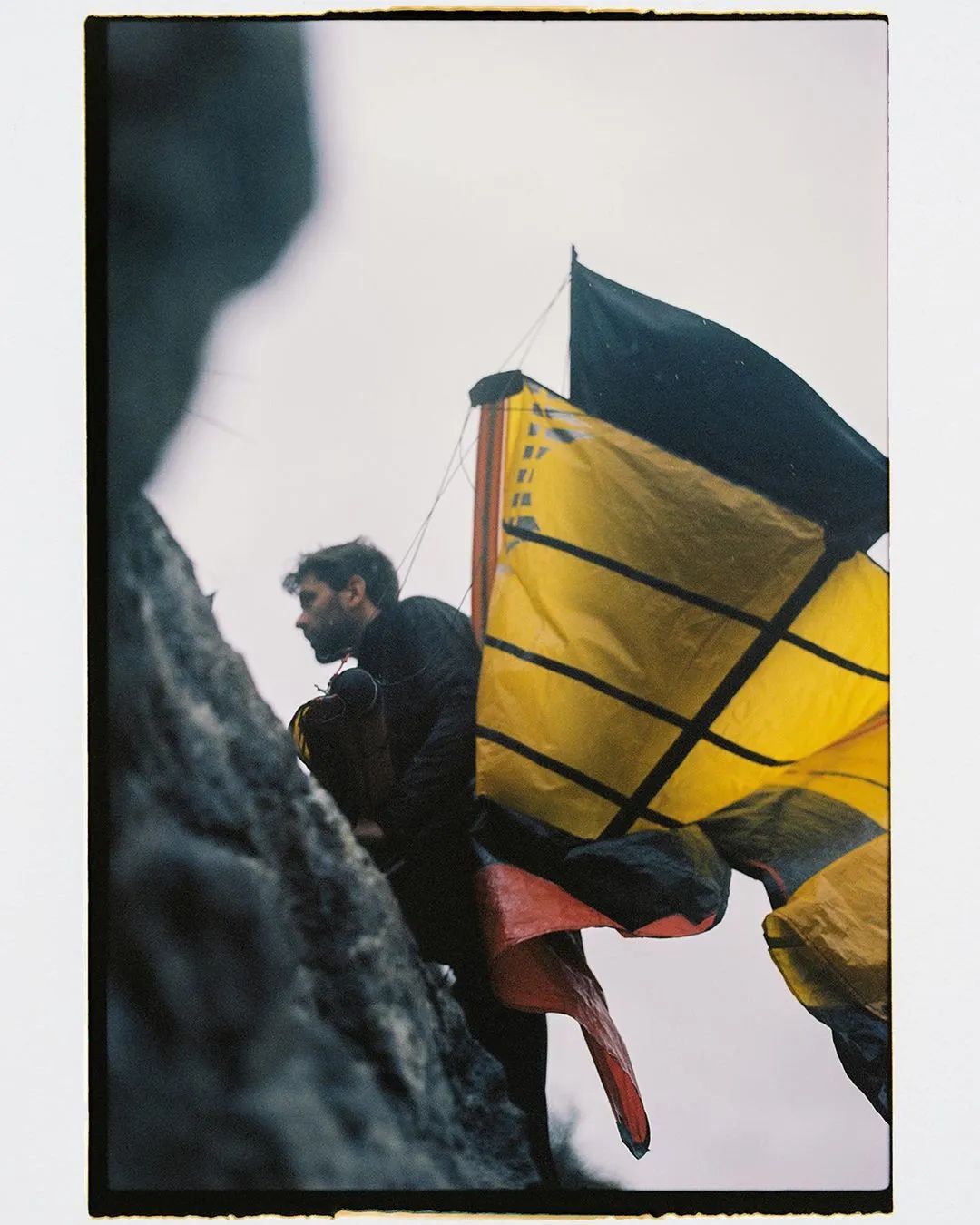
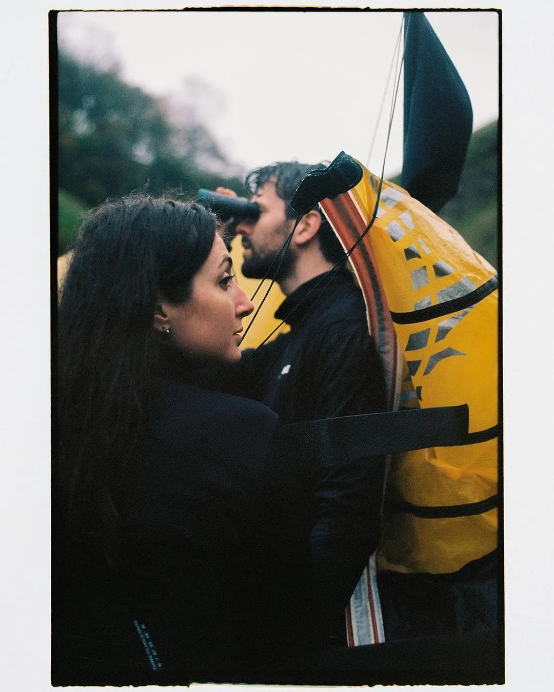
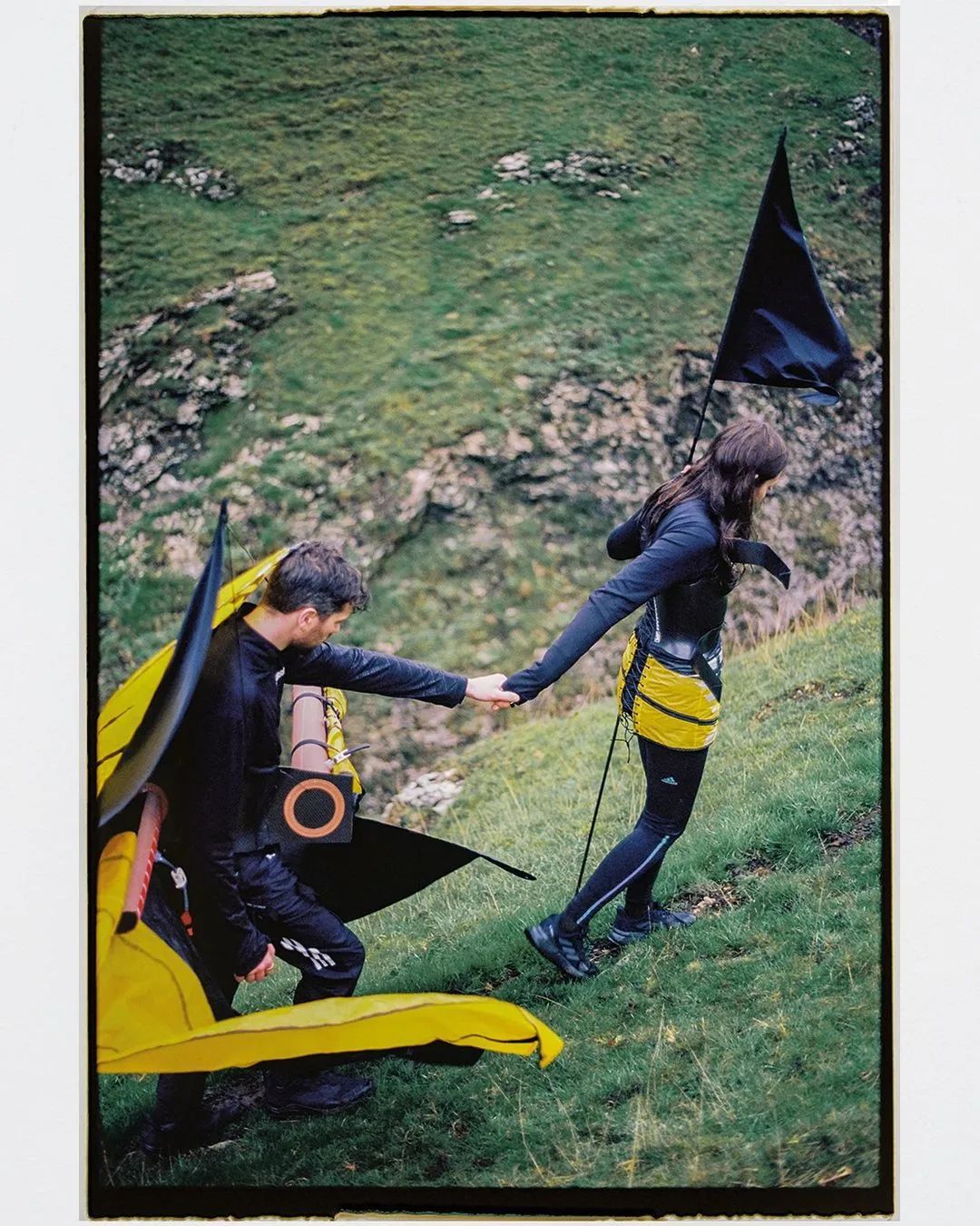
"Something to hold onto"对我来说真的很特别–它是与设计师Oliver Haus的合作项目,由Frankie Markot在山上拍摄。我想进一步发展这种浪漫的冒险概念,我为一对夫妇设计服装,记录他们在户外的旅程。这就是为什么它需要摄影,并在展览中与我的绘画一起展出,以使人们注意到帆布画中的这个主题。考虑到服装的不便,它象征着每个人的私人行李,以及极端的天气条件,这些照片所包含情感是史诗般的。我真的很高兴能与如此有才华的团队一起合作并创造如此有意义的东西。 |
|
||||
Something to hold onto, 2022, ©Ben Edmunds
Something to hold onto, 2022, ©Ben Edmunds
|
神圣性和概念性与我们的精神和情感体验密切相关,你会觉得自己的作品与它们有关吗?如果是的话,你是如何在作品中创造情感共鸣和感性体验的? | ||||
|
我认为这些画是关于寻找精神体验的。我认为比如坐在罗斯科小教堂里,这种能感受到一些东西的行为可以与登山联系起来,并希望在登顶时得到一些启示或美好。画作的标题,有时会呈现在画框上,暗示这个主题通常与神圣性和精神体验有关。 |
|
||||
A measure of the time spent waiting, 55.5×35 cm, fabric dye and acrylic on canvas with custom straps, unique, 2019, private collection (BE), ©Ben Edmunds
|
你的作品的表面和命名使用了各种数字的排列组合,这是否与你以前的运动员身份有关?我们应该如何理解它们? | ||||
|
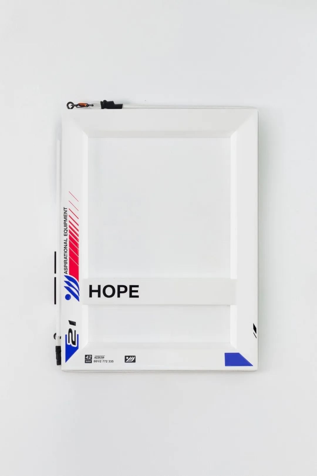
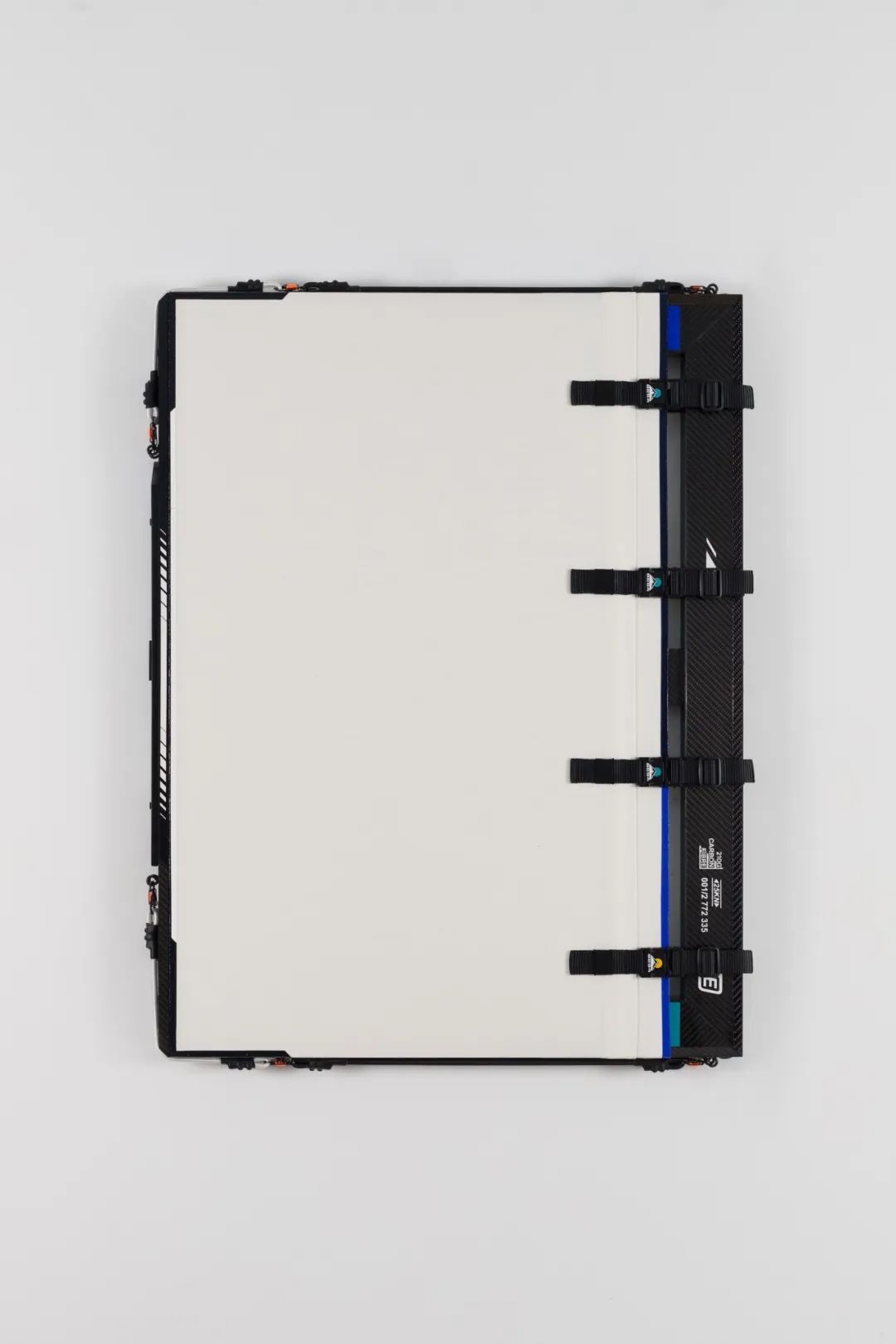
虽然画的标题有诗意的阴谋和浪漫主义,但我也喜欢用数字和代码来编排作品。对我来说,这些是他们的第二个标题,而且信息美学有一些奇妙的东西。我喜欢可以在雨衣的内侧读到雨衣的防水等级。我喜欢能读出碳纤维自行车框架的重量。它们以极其风格化的方式呈现,而且我们越来越多地在Off-White等时尚品牌中发现这种美学,尽管这些服装并不适合在山上穿。艺术品也充满了信息,通常只能在运输单据和海关文件上找到,但我也喜欢把这些作为作品的一部分来呈现。关于艺术品的信息中,最迷人的是艺术家的名字。对某些人来说,这比艺术品本身更重要。有趣的是,这就是为什么我想从我的BE签名中创建一个标志。让人们思考一个艺术家的作品和他们的“品牌”之间的关系。为了进一步发展,我与一位平面设计师合作,在英国注册了一家真正的公司(Aspirational Equipment)。这个伪运动品牌只负责制造这些艺术作品,并再次将框架色域绘画定为一种冒险运动。 |
|
||||
First moments (final movements), 220×200cm, Fabric dye and acrylic on canvas with wood and carbon fibre frame, webbing and buckles, 2021 , ©Ben Edmunds
|
There’re many sports equipment in your work. What inspired you to combine it with painting? | ||||
|
This project began during my final year at RCA, I had previously been making figurative paintings based on outdoor holiday posters. I was already interested in ideas of escapism and exploration and how they relate to being a painter, but it began to dawn on me that a painting functioned as a tool for an experience, rather than the experience itself. In the way that Goretex boots might help you to climb a mountain, what could a painting help you achieve? Soon my paintings began to feel increasingly like pieces of adventure equipment, and took inspiration from my background in sailing and windsurfing. |
|
||||
AE-5.04, BE.19, 40×30cm, Gloss paint and vinyl decals on wood with shock cords and carabiners, 2021
|
How would you describe your creation process? | ||||
|
I would describe it as divided. I keep two studios: one in the countryside for painting, and one in the city for assembly and sculpture. The painting studio is messy and the process is emotional. The London space is more clinical and organised. This describes the two sides to my practice and probably to a large extent my personality! |
|
||||
|
What is the relationship between frame and canvas in your work? | ||||
|
This relationship could be seen as the reconciliation between the two worlds I just described. I like to find innovative ways to fix the canvas to the frame that appear slick and resolved, appearing like readymades, but with an inescapable handmade quality. I like to imagine the canvas as a sail and the frame as the spars. I am constantly searching for unusual ways that fabric can fixed to frames in the wider world – whether it be in adventure sports, bill boards or HGV walls and try to apply these methods to my work to question traditional conventions in how to make a painting. |
|
||||
The edge of hope, BE.26, 40×30cm_Fabric dye, acrylic and PSP Spinnaker tape on canvas with webbing, buckles and carbon fibre stretcher, 2021
|
Would you describe yourself to be a artist of colour-field painting? What do you think makes the painting language in your work most different from other artists of your kind? | ||||
|
I describe my painting practice as colour field painting in a very conventional sense. I hugely admire the paintings of Jules Olitski, Ellsworth Kelly and others. But these artists were pioneering many decades ago. Colour field is a slightly unfashionable genre right now, perhaps linked to the patriarchy of its history, but in essence it’s a very relevant approach. It connects to a desire for open spaces and spiritual transcendence that we are really thirsty for. It also relates to the digital gradients we see every day on screens. What makes my work different though is its reframing as an adventure ‘sport’. Recognising the act of making – or looking at – colour field painting as an search for experiences in expanses, and bringing that back to my personal history in outdoors sports. |
|
||||
Infinite Affinity II, BE.24, 100×75 cm, Fabric dye and acrylic on canvas with eyelets, etched bolts, gloss painted stretcher, webbing and buckles, 2021
|
How did you conceive the project 'Something to hold onto'? Why was it presented as photographs rather than paintings? | ||||
|
Something to hold onto was really special to me – a collaborative project with designer Oliver Haus, photographed in the mountains by Frankie Markot. I wanted to further develop this romantic notion of adventure by creating outfits for a couple and documenting their journey in the outdoors. This is why it needed to be photography, and was presented in an exhibition alongside my paintings to bring attention this theme in the canvases. Given the inconvenience of the costumes, which came to be symbolic of each individual’s personal baggage, and the extreme weather conditions, this emotion of these photographs is epic. I was really happy to create something so meaningful with such a talented team of collaborators. |
|
||||
Something to hold onto, 2022, ©Ben Edmunds
Something to hold onto, 2022, ©Ben Edmunds
|
Sacredness and conceptualism are closely linked to our spiritual and emotional experiences, does your work relate to them? If so, how do you create emotional resonance and sensual experiences in your work? | ||||
|
I think these paintings are about searching for spiritual experiences. I think the act of sitting in the Rothko chapel, hoping to feel something can be related to the act of climbing a mountain in the hope of some revelation or beauty at the top. Titles of paintings, which are sometimes presented on the frames allude to this theme are usually connected to sacredness and spiritual experience. |
|
||||
Impossible distances, distant first, BE.20, 80×60cm, Acrylic on bleached canvas with webbing, buckles and carbon, fibre frame, 2021, ©Ben Edmunds
|
The surface and naming of your work uses various permutations of numbers, does this relate to your former identity as an athlete? How should we understand them? | ||||
|
Whilst the titles of the paintings have poetic intrigue and romanticism, I also like to use numbers and codes to catalogue the works. For me these are their second titles, and there is something beautiful about the information aesthetic. I love how you can read the waterproof rating of a rain coat on the inside of the jacket. I love how you can read the weight of a carbon fibre bike frame. They are presented in super stylised ways, and increasingly we are finding this aesthetic in fashion brands such as Off-White, even though these garments are not meant for the mountains. Artworks are also full of information, usually only found on shipping proformas and customs documents, but I also like to present this as part of the work. The most heavily fetishised piece of information about an artwork is the name of the artist. For some this is more important than the artwork itself. Playfully, this is why I wanted to create a logo from my BE signature. To make people think about the relationship between an artist’s work and their ‘brand’. To develop this even further, I worked with a graphic designer and registered a real company in the UK (Aspirational Equipment). This pseudo-sports brand is solely responsible for the manufacture of these artworks and again, framing colour field painting as a sort of adventure sport. |
|
||||
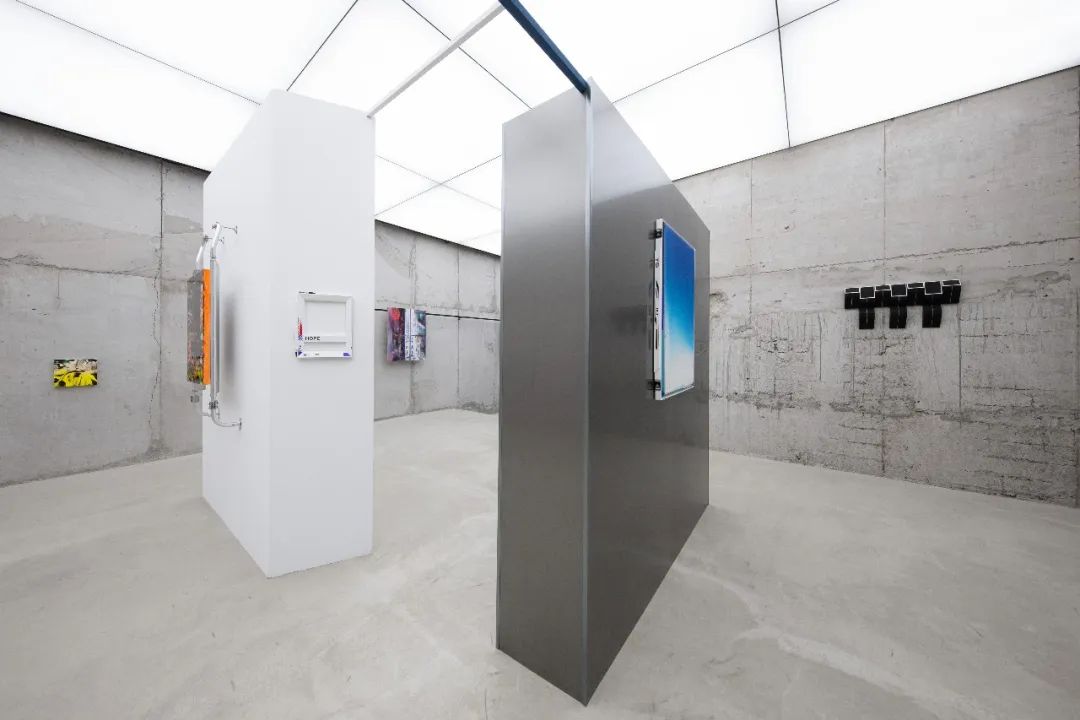
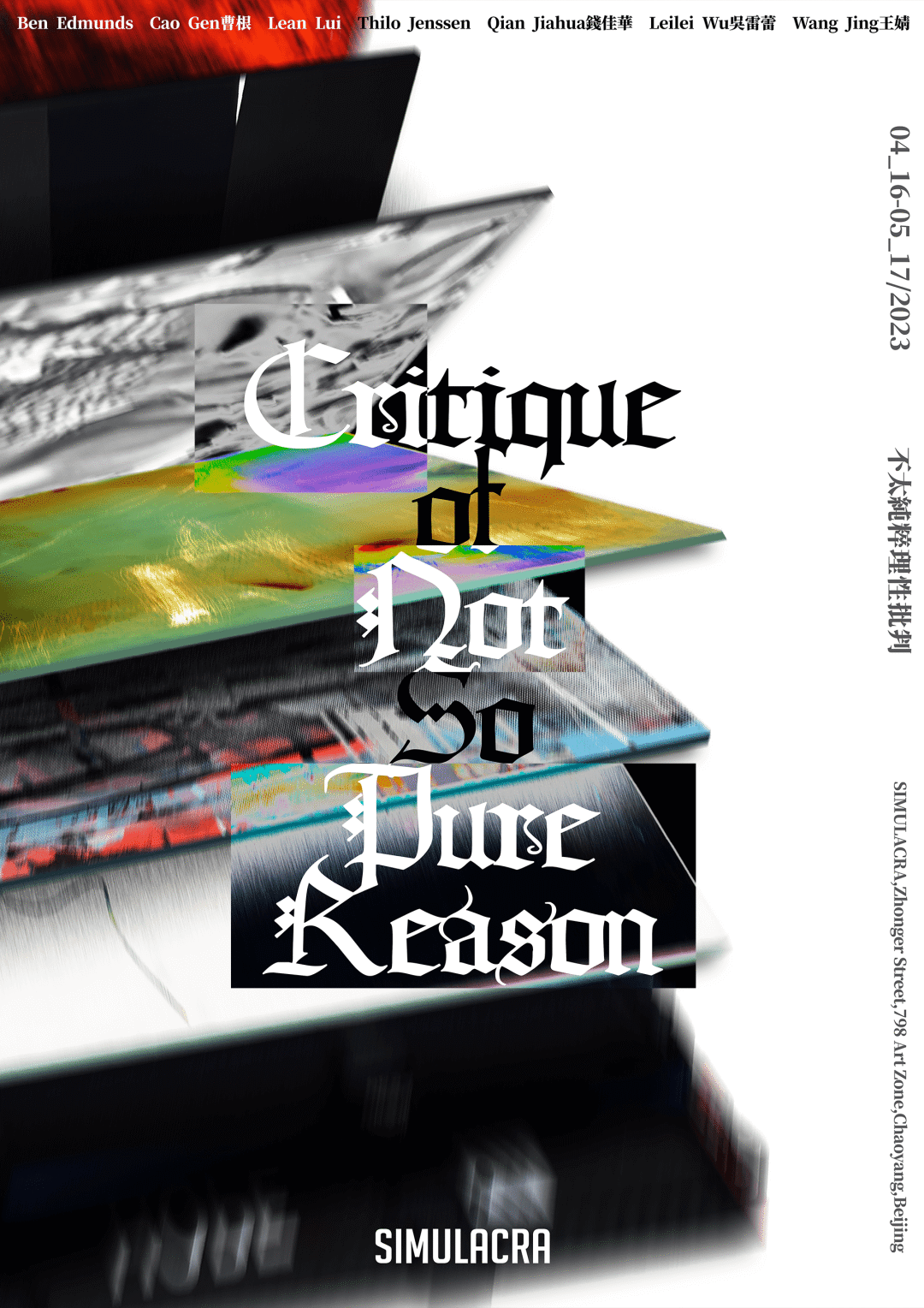
Critique of Not-so-pure Reason不太纯粹理性批判, SIMULACRA拟像, 2023
©文章版权归属原创作者,如有侵权请后台联系删除